Today I’m sharing a Home Refresh E-Design I created for a breakfast area in an Elegant, Mid-Century Modern style home with an eat-in kitchen layout. Get all the links and sources below.

Design Idea For An Eat-In Kitchen Layout
Alright Magic Makers, let’s get back to something we all love… MOOD BOARDS.
This was a paid design from 2023 that my client/friend is graciously letting me share with you today. She was hosting her upcoming wedding at her home this Fall, and reached out for help with the finishing touches in her living room and dining room before the big day.
This was one of my favorite projects because I know my friend isn’t afraid to go bold or different.
Her style is really elevated, but definitely with an emphasis on cozy and comfort. All design decisions were centered around her family and creating a space for them to be together.
She already had a few ideas for these rooms. We worked through the best options for measurements, style, and quality.
Hall Bathroom Remodel To Coordinate With
She hired a contractor to remodel the half-bath just down the hallway of this eat-in kitchen layout. The vibe was color – a bold, dark floral wallpaper, a black fluted vanity, with a white counter and gold hardware. Because this bathroom is so close-by, we needed to coordinate all the furnishings together.

We worked through a lot of different options for this eat-in kitchen layout. It felt small and low. Originally we planned to push the chairs up against the wall or maybe even use a banquet seat.
She’s eventually planning to remodel her flooring and kitchen but we wanted to find a style that would look great with what she has now.
Unique Dining Chairs Options

We wanted open leg style chairs and a slim, round table to save space.
Round Breakfast Table Options

A flushmount light made the most sense with the low ceiling height. Along with curtains. Because of the layout with the patio doors, a rug didn’t quite make sense in here.
Flushmount Lighting Options

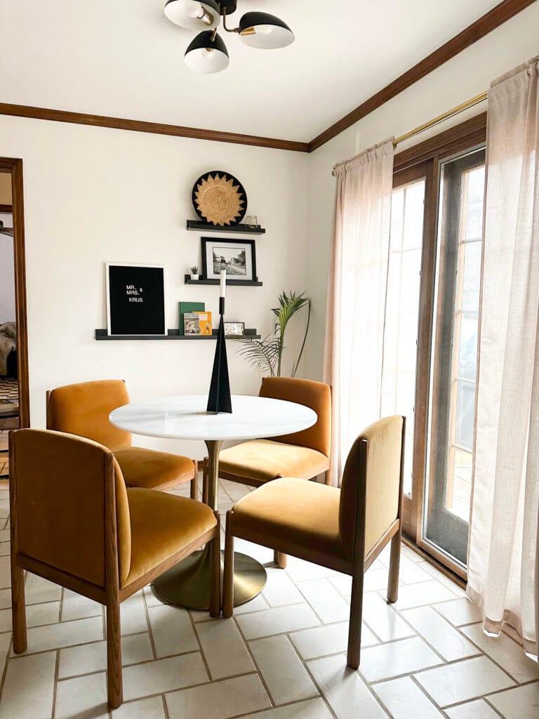
Since she has black finishes in a few other places in her home, we went with a black ceiling light. The marble and gold table was the perfect size, and brought a few other textures to the space. The black table tops felt a little too dark.
The velvet gold/orange chairs stole our hearts and we couldn’t let them go. They went perfectly with the wallpaper in the bathroom just down the hall! And set the tone for the other options in this eat-in kitchen layout.
My friend added simple black Ikea floating shelves with meaningful decor, a table centerpiece, and linen curtains from Amazon to bring it all together.
Elegant, Modern Breakfast Table in an Eat-In Kitchen Layout – Final Look

Here’s what my friend said about this space and process:
“These chairs are the best piece of furniture I’ve ever bought in my life. The quality is unmatched and worth every penny. They are gorgeous, sooo sturdy, and make the space. They were totally the anchor for that space and the spaces around it.
The table is awesome. Perfect for four people. The marble top is super heavy and the table is great great quality.

Curtains are gorgeous and from Amazon. They are a linen blend and warm that space perfectly. I’m usually a white flowy curtain girl and love the warmth and tone of the tan color.

As you know I like a mid century look, but also I don’t like design for design. In fact, I hate that. I want it to reflect me, my family, etc so it’s sooo important to me to have pieces that are personal in every space in my room without it looking homemade or like a cheap and tacky DIY.”

Links/Sources:
- Marble Top & Gold Table
- Orange Velvet Dining Chairs
- Flushmount Black Light
- Natural Linen Curtains from Amazon
- Flax Linen Curtains from Quince
- Brass Curtain Rods from Ikea
- Antique Clock – Similar
- Shelves from Ikea
- Picture Frame – Similar
- Letterboard – Similar
- Candle centerpiece – Similar
- Woven Wall Basket – Similar
- Majesty Palm Plant & Stand
- Books – personal vintage favorites
Alternative Design Ideas For An Eat-In Kitchen Layout
It’s always wild to me how change changing one design element can shift the whole look. Here are a few other design alternatives we considered.
Get all the mood board links here. (Sharing later this week).


This room is a perfect example of blending high-end with simple pieces. You don’t need to invest tons of money in every item in the room. A few high-quality statements are all you need. Can’t wait to show you her finished living room too!


