If you want more color in your home but it feels like “too much” then you need this design trick.
I read once that having a home color scheme is a helpful way to create a good flow in your home design. I took it to heart immediately. 3 years in, and this has been the single most helpful practice to create a colorful home that doesn’t feel disjointed.
Our Home Color Scheme Inspo
Shortly after we moved into our home 3 years ago, I found a large, faux canvas print from Target on sale for $25. It had all my favorite color players: greens, blues, and pinks. It’s moved around from over our fireplace, to above our desk, and now hangs in our dining room.

I decided early on that I would only choose paint colors for my home that coordinated with this one piece of art.
For every new paint color I picked in our home over the years, I held it up to this painting and made sure it would match within its color scheme. I found that I could use a LOT more colors than I expected. Grays, beiges, whites, oranges, browns, and lots of variations of greens, blues, and pinks.
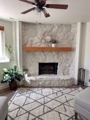
This practice helped me decide that I didn’t want the black accent wall in our living room anymore. It didn’t fit in my color scheme! I can honestly say that changing our fireplace wall to white, and our fireplace to green, has made my home feel much more cohesive.


Balancing lots of color in one home, especially a small one, can be tricky. Our home is small enough that you move between spaces quickly. I really wanted to get my paint colors right.
Selecting Neutrals + Colors Together
First, I chose the same white paint color for most of my home – White Dove by Benjamin Moore. This color is in our main living area, dining room, and kitchen, and the hallway leading to our bedrooms. I used white in both our small bedrooms, and our primary bathroom as well. This is like the glue that holds it all together. The base color repeated throughout helps my small home feel connected. It also makes our small bedrooms feel larger.

Next, I layered accent colors throughout my home.
When To Use Colors vs. Neutrals
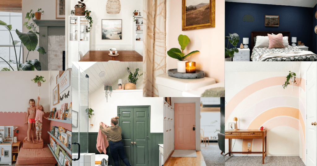
I added a pink rainbow in one bedroom, and a pink scalloped paint accent in the other. Our primary bedroom became a moody, dark blue. I also added a dark green on the lower half of our primary bathroom. Our fireplace is now an ashy blue-green, and our front door is bright pink. Oh, and now we have a very pink hall bathroom! I’ve been able to repeat some of the same colors but in different variations throughout.

It all flows together in a way that feels homey because the colors all go together.

If you struggle with knowing what paint colors to pick for your home, try this trick! Choose one item of inspiration, and coordinate all your paint colors to go with that one piece.


